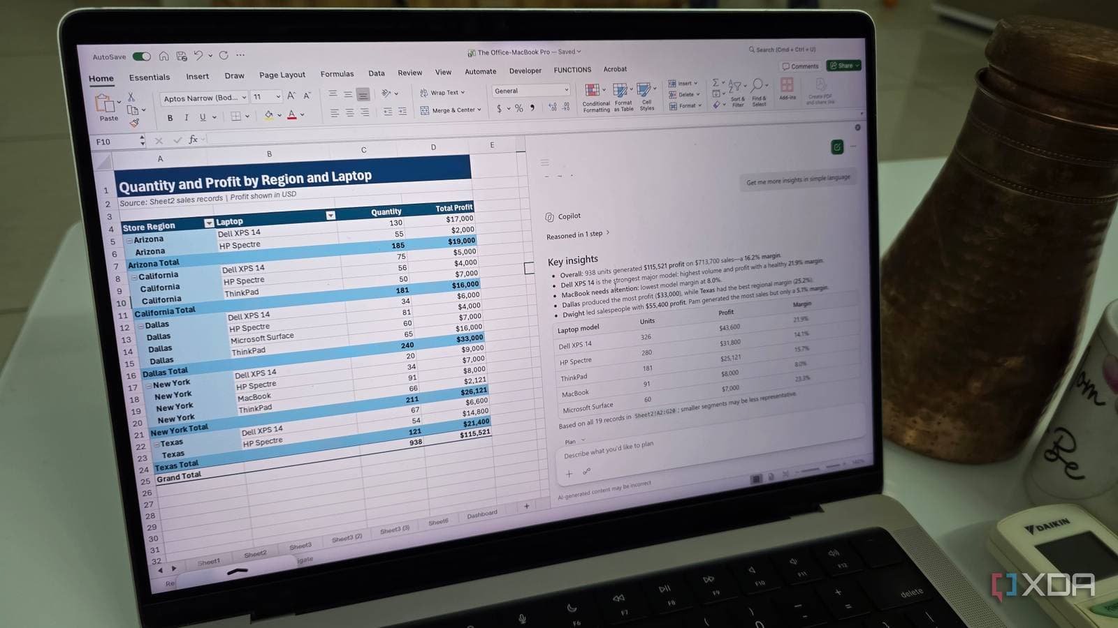
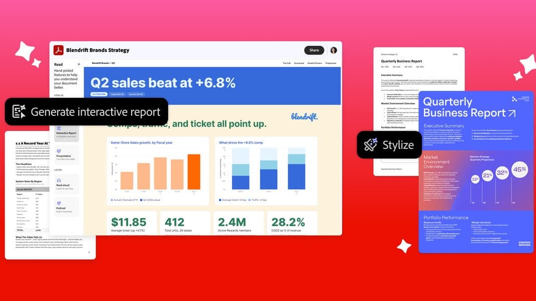
The monthly ritual of rebuilding charts for a status report may be on its way out. Excel Canvas, a new Copilot feature in Microsoft Excel, turns workbook data into a polished, interactive report of visualizations, metrics, and insights — and the report refreshes on its own whenever the underlying numbers change. General availability begins in mid-October and completes by the end of the month, according to Microsoft's message to IT administrators (MC1485411), covering Excel for Windows and Excel on the web worldwide.
What Excel Canvas does
Copilot generates the initial canvas from your workbook: charts, key metrics, and short written insights, laid out as a report rather than a grid of cells. From there, you refine it by asking in plain language — swap a chart type, add a metric, reframe a section — instead of rebuilding each element by hand.
The canvas stays linked to the spreadsheet. A canvas created at the start of a month still reflects the workbook weeks later: manual edits show up in the charts, and so does data the workbook pulls in from external sources. That standing link is the real change — today, most Excel reports are snapshots that go stale the moment the data moves.
Rollout and requirements
- Platforms: Excel for Windows and Excel on the web.
- Timeline: General availability rolls out from mid-October through end of October 2026, slightly later than the September window Microsoft first targeted.
- Requirement: Access to Copilot in Excel — meaning a paid Microsoft 365 Copilot license on top of a regular Microsoft 365 subscription. Without Copilot, there is no Canvas.
- Deployment: It arrives in the worldwide standard multi-tenant cloud, so Philippine Microsoft 365 tenants are in the same rollout as everyone else.
Excel Canvas also lands in a stretch of rapid change for Excel's AI tooling: it arrives alongside Microsoft's testing of multiple values per cell, and follows the discontinuation of the COPILOT() worksheet function in August 2026. The pattern is clear enough — Microsoft is moving Copilot out of individual cells and formulas and into whole-workbook views like Canvas, where it summarizes and presents rather than computes.
A note of caution before you share that report
Copilot chooses which metrics and chart types represent your data, and its choices are not guaranteed to be the right ones. Microsoft's own guidance is to compare each chart and metric with the source cells before sharing the report. That advice deserves emphasis anywhere a canvas feeds a decision: an auto-generated chart that quietly aggregates the wrong column looks exactly as polished as a correct one.
Why Filipino office workers should care
Report-building is a daily task across the industries that run on Excel here — BPO operations dashboards, sales trackers, school records, government reports. A self-updating report view removes real, repetitive work from those routines, and because the rollout is worldwide, offices in the Philippines get it at the same time as everyone else. The catch is the Copilot license: for many local companies that cost has been the blocker, and Excel Canvas is now one more feature on the list of what they are paying for — or doing without. AI features landing inside the tools Filipino back offices already use is a running theme this year, much like the per-hour transcription pricing we examined in our report on Microsoft's MAI Transcribe 2 and what it signals for Philippine BPO.