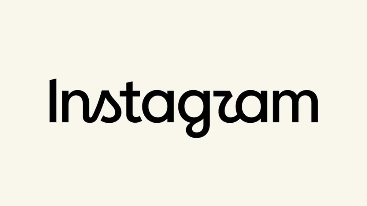
Instagram has a new wordmark — the first change to the text logo at the top of the app in a decade. Instagram head Adam Mosseri announced the redesign on Thursday, August 13, 2026, in a post on Instagram and Threads. "The wordmark at the top of the app hasn't changed in 10 years, so it was time for a refresh," Mosseri said in the announcement, as Fast Company reported. The refresh is purely visual: the colorful gradient app icon on your phone's home screen is not changing, and no features change with it.
Mosseri described the new look as "cleaner and more modern, with references to the original and the simplicity and craft that's always made it Instagram."
What changed in the Instagram wordmark
The old wordmark used a flowing cursive style that Instagram had carried since its 2016 rebrand — the same overhaul that replaced the original camera icon with today's gradient design. The new version is a hybrid. It keeps hints of script: the "n" and "s" are still connected, and the "r" and "g" end in playful swooshes. But other letters, such as the "a" and "m", have been squared up into plainer sans-serif shapes (sans-serif means letters without the small decorative strokes at their tips). The result is bolder and simpler, with tighter loops than the old cursive.
The change also nudges Instagram closer to the look of its sibling apps. Facebook and Threads both use sans-serif wordmarks, so the added sans-serif letterforms bring Meta's family of apps visually closer together.
Creative Boom reports that the project was led by Jasmine Probst, director of product design at Instagram, and May Hartono, director of brand design at Meta. The team explored hundreds of directions before coming back to a script-based mark, on the reasoning that script reflects individuality.
Instagram Sans, Instagram Pen, and Instagram Mono
The wordmark is only the most visible part of a wider brand refresh built on three typeface families:
| Typeface | What it is | Where it is used |
|---|
| Instagram Sans | A refined version of the existing brand font, now with wider proportions and flatter stroke endings | General branding and interface text |
| Instagram Pen | A new custom handwriting-style typeface | Drawing tools and expressive text |
| Instagram Mono | A new monospace typeface (every character takes up the same width, like typewriter text) | Technical and stylistic uses across the brand |
The gradient — the pink-orange-purple blend Instagram adopted in 2016 — stays, according to the design team, as a core part of the brand that will simply be used with a lighter touch.
The app icon stays, and the rollout is already live
The camera glyph on the app icon is not changing. TechCrunch noted on launch day that Meta had not said whether an icon change would follow; Creative Boom's report since confirmed the icon remains identical. The new wordmark rolled out globally right away, while the rest of the brand system — the new typefaces and refreshed design language — arrives gradually through 2026 and beyond.
Why people are joking about "Instagzam"
Reactions have been mixed. Within hours of the announcement, users pointed out that the new "r" can read as a "z", and the joke nickname "Instagzam" spread across social media. One designer quoted by Fast Company called the mix "funky in the worst way possible," arguing that the logo leans into classic script while dropping in a standard sans-serif "a" and "m", and that the "I" sits at a different weight. Others praised the tidier, more legible cursive.
What it means for Filipino users and sellers
The Philippines is a sizeable Instagram market: about 31.3 million Filipinos were on the platform as of July 2026 — roughly 25.8% of the population — according to NapoleonCat's tracking data, with 18-to-24-year-olds as the largest age group. For all of them, nothing functional changes. There is no app update to install, feeds and messages work the same, and because the icon is untouched, the app looks the same on the home screen. The new wordmark is already live globally, so Filipino users should see it in the app now.
The one group that may need to act, eventually, is small businesses and creators who print the Instagram wordmark on packaging, signage, or marketing materials — a common sight among online sellers here. Those materials show the old logo now, and the refreshed brand assets are rolling out through 2026 and beyond. No deadline has been announced, and there is no Philippines-specific rollout schedule — the change is global and simultaneous.